Return to blog list
Visited 7214x
Heinz Denckler booklets - detailed description
Published on 22. Nov. 2018Visited 7214x
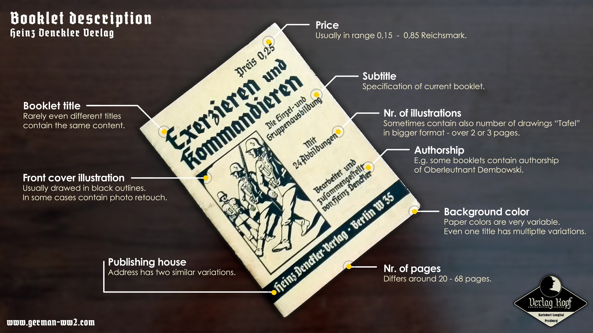
Welcome to the second part of our analysis where we better look at the appearance of brochures itself.
Although they look very similar and unified, in fact there are many differences (colors, size, fonts). As for now we think that it highly depends on printing company. From our collection we found the following companies, that were producing these booklets in 30-40th years:
- Buchdruckerei Otto Heidrich, Berlin NW87
- Paul Jung, Berlin N 4
- Saladruck Steinkopf & Sohn, Berlin SO 16
- Deutsche Zentraldruckerei AG., Berlin SW 11
- Buchdruckerei Franz Spiller, Berlin SO 36
- Beholz druck Berlin
- F. Beaufort, Prag, Jungmanngasse 15
- ,,Grafika" Druckanstalt in Pilsen - 807
- Frant. Bartoš, Prerau (Protektorat)
The last two were located in Protektorat Böhmen und Mähren.
Most visible differences among each title:
- average size is format A6 (that was already standardized in that time), but each piece significantly differs +-10mm
- perhaps we might think that each title has its assigned color, but the truth is that we can find each title on multiple different color backgrounds
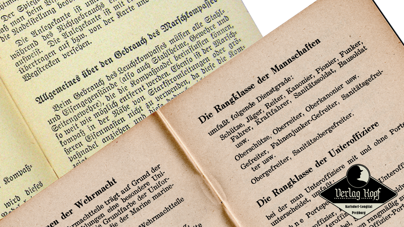
- text font differs mainly according to year of publishing (Gothic font Fraktur was discontinued since January 1941, when Martin Bormann, director of the Party Chancellery issued a directive discontinuing of this font) see below the text font difference.
We measured weight of used paper, and we got surprisingly leight type - only about 65g/m2. Paper types differ only slightly among titles.
Stay tuned for next article, with overall overview of booklets.
Latest articles in blog
- [21. 12. 2025] Feldfu project - Gen 5
- [11. 02. 2024] Feldfu project - gen 4
- [30. 09. 2022] Feldfu project - the end is near
- [27. 07. 2022] Feldfu project - connection established!
- [21. 07. 2022] Feldfu project - introduction